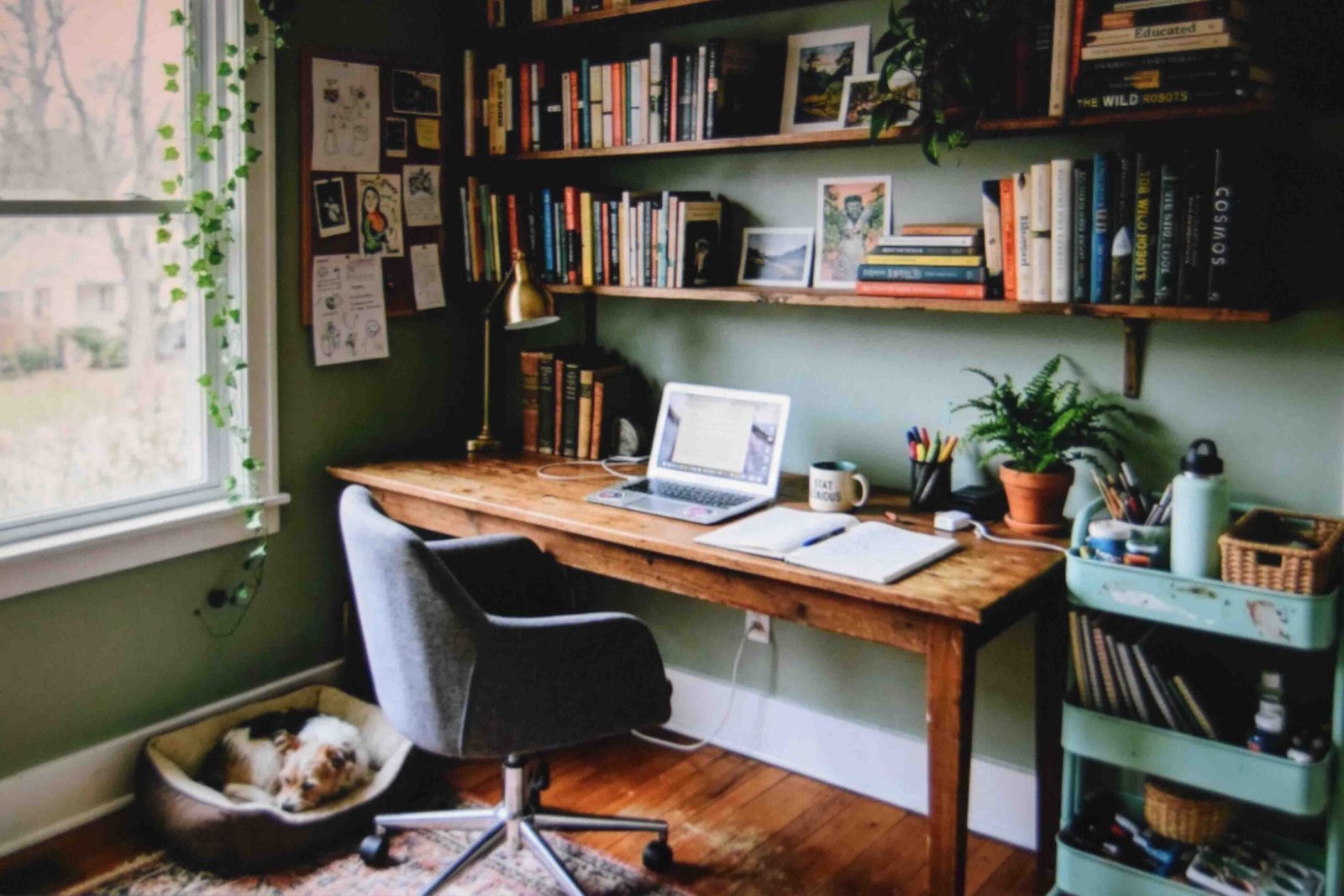





Read your lease again. No paint, no drilling, nothing adhesive on the walls. Standard language in most US rentals.
Now read almost any retro decorating guide. Paint the wall olive. Install a picture rail. Tile the backsplash. None of it applies to you.
So this is the other version. Everything below stays portable, comes apart on move-out day, and still gets you a room with actual personality in it.
Why This Style Suits Renters Better Than Most
Other looks ask you to change the building itself. Wainscoting, tile, built-in shelving. A retro apartment aesthetic asks you to change the objects instead, and objects come with you.
Color does the heavy lifting here. So does silhouette. A rug carries the pattern, a lamp carries the glow, a credenza carries a whole blank wall on its own. Not one of those is screwed into anything.
There is a budget side too. This style tolerates mismatched pieces better than almost any other, which means one purchase a month instead of a full room at once. Slight unevenness reads as collected rather than careless, provided the colors agree.
1. Trade Bright White for Off-White at the Base
Avocado green is where everyone starts. It is also what goes wrong fastest, because against stark white it turns sour and shouts.
Sit it on off-white or cream and the same green calms right down.
No painting allowed? Build the cream layer out of fabric instead. Unlined cotton curtains hung high and wide, a heavy knit throw, a canvas shade. Fabric covers more square footage than people expect.
The mistake I see repeated is saturated green cushions dropped straight onto builder white walls, then blaming the green.
One exception. If your walls lean cool gray, green will fight you the whole way. Use mustard there instead.
2. Buy Four Pieces of Retro Apartment Decor Before Any Furniture
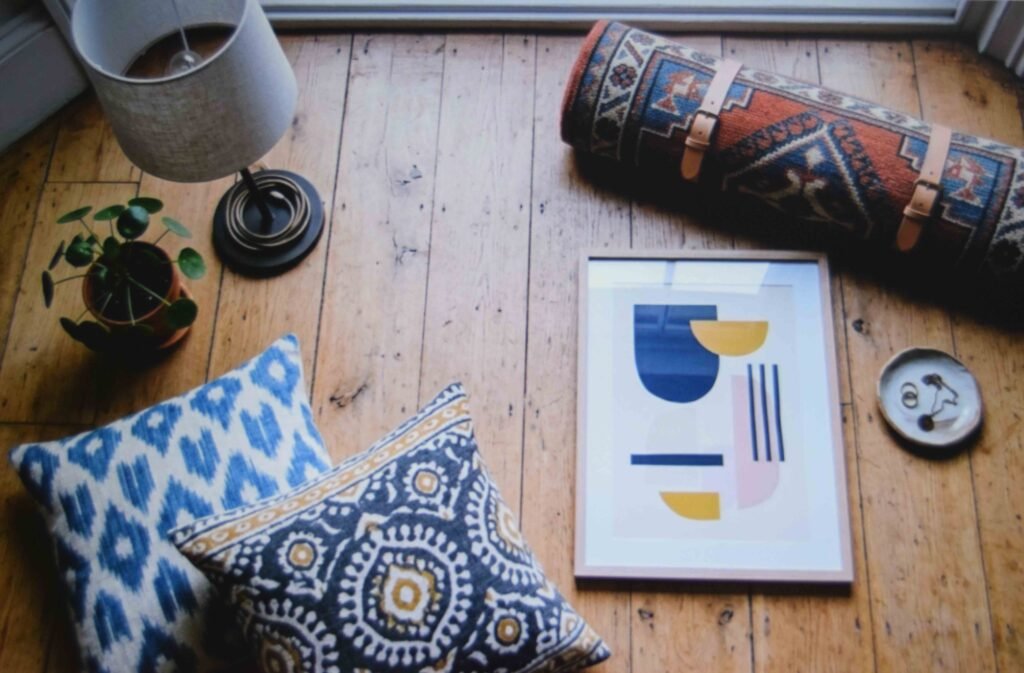
A sofa can wait. Four inexpensive things will set the mood while you save for it.
One amber-toned table lamp. A graphic rug. A single framed print in period colors. Cushions that share a palette.
Put those in the room together first, because they tell you what the space wants. Any room that looks right with those four will look right with a walnut credenza later.
Stick to that order as well. Lamp first, since light rewrites the color of everything else after dark.
Beginners usually flip it and buy the statement chair on day one. Then they spend six months building around a piece that never really fit.
3. Choose One Color Story and Refuse the Fifth Shade

Pick a family and live inside it. Reds, oranges and browns is the classic 70s apartment aesthetic route, and secondhand pieces in those tones are everywhere.
With the story locked, you can put a geometric pattern next to a floral one and nothing falls apart. Shared color does the holding, not shape.
Too heavy for your unit? Go gentler. Cream with terracotta. Cream with sage. Cream with dusty blue.
Black and white stays sharp forever, but it turns clinical in a room with one window.
The failure point is always the fifth color. It arrives as a gift or an impulse buy. Send it to the bedroom and keep it out of the main sight line.
4. Let One Big Rug Do the Zoning
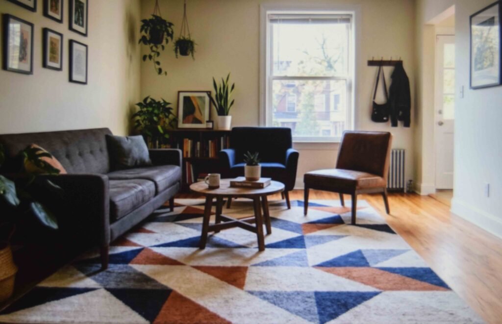
Scattered little rugs make a compact apartment read smaller still. A single large one pulls the seating into one zone and gives the eye a place to rest.
Map your walking paths before buying. Front door to kitchen, sofa to hallway. The rug belongs inside those paths and never across them, because a curled edge in a doorway is a daily irritation and a genuine trip hazard.
Got a patterned rug? Square it up with the longest wall. Off-angle edges look like a mistake even when nobody can explain why.
On hard floors, a grip pad underneath is not optional. Skip it and the whole retro apartment aesthetic slides sideways a few inches every week.
5. Drop the Seating Low and Round Off the Table
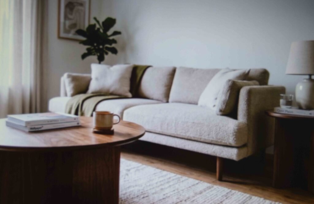
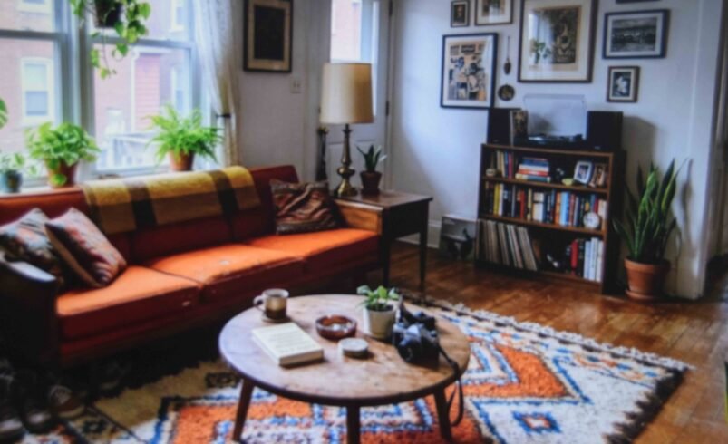
A solid block of color on the sofa wants something to break it up. A round walnut coffee table does that far better than a rectangle, and it removes two sharp corners from a tight floor plan at the same time.
Take the side tables down too. Match them roughly to seat cushion height so the arrangement holds one long lounging line instead of stepping up and down across the room.
That single detail is what makes a mid century modern apartment living room look deliberate rather than assembled from whatever was on sale.
Tall skinny side tables destroy the effect on contact. Even expensive ones.
6. Give the Credenza Space on Both Sides
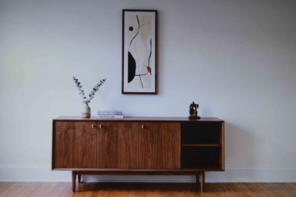
The low walnut credenza is the most useful object in this entire style. Records, cables, board games, the router, spare bedding. All of it vanishes behind two doors.
But it only reads properly with clear wall around it. Crowd both ends with a lamp, a plant and a leaning stack of frames and you lose the long horizontal line that made the piece worth buying.
Leave a genuine gap either side. Hang art above it that stops short of the cabinet width.
For renters this doubles as storage you are actually permitted to own, since built-in shelving is off the table entirely.
Avoid centering it under a short window though. The proportions argue with each other and there is no fixing it afterwards.
7. Test Peel-and-Stick Wallpaper Before You Cover a Wall
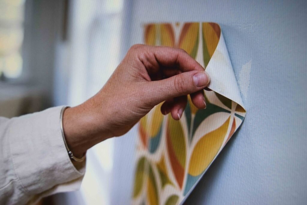
Removable wallpaper is as close to a real pattern wall as renters get. It is also the single item most likely to cost you a deposit.
Order a sample sheet first. Stick it low down where furniture hides it, leave it a week or two, then peel it back slowly and inspect the paint. Freshly painted or older chalky walls are the risky ones.
Go for a medium-scale motif. Something legible from the far side of the room rather than a tiny print that turns to visual static from six feet away.
And stop at one wall. Pattern on all four in an apartment feels like living inside a gift box.
8. Layer Three Lamps and Park One Beside a Mirror
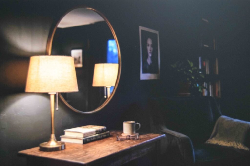
Overhead lighting works against everything here. Rental ceiling fixtures throw a flat bluish wash that drains every earthy tone you just paid for.
Use three sources at different heights instead. Floor lamp behind the seating. Table lamp on the credenza. Something low and small near the floor.
Then set one of them next to a mirror or a metallic surface. That reflection doubles the evening glow and fills a dead corner without needing another outlet.
Amber bulbs only, around 2700K. A cool white bulb inside a mushroom lamp is the quickest way to make a good fixture look like a knockoff.
9. Break the Grid on Your Gallery Wall
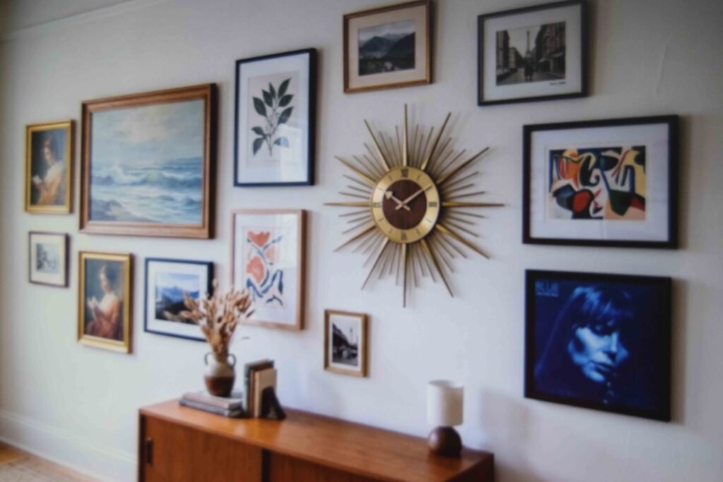
Rows of matching rectangles read like a hotel corridor. One round object fixes the whole thing.
Slide a circular mirror or a sunburst clock into the arrangement and the wall relaxes instantly. The eye follows that curve and accepts everything else as intentional.
Album covers earn their place here and cost close to nothing. Choose one whose colors echo the chair or the rug so it belongs to the room instead of floating on its own.
Lay the full arrangement on the floor and shuffle it before anything goes up. Then use adhesive strips rated well above the actual frame weight.
Glass frames directly over a bed are worth skipping altogether.
10. Ration Your Cane and Rattan
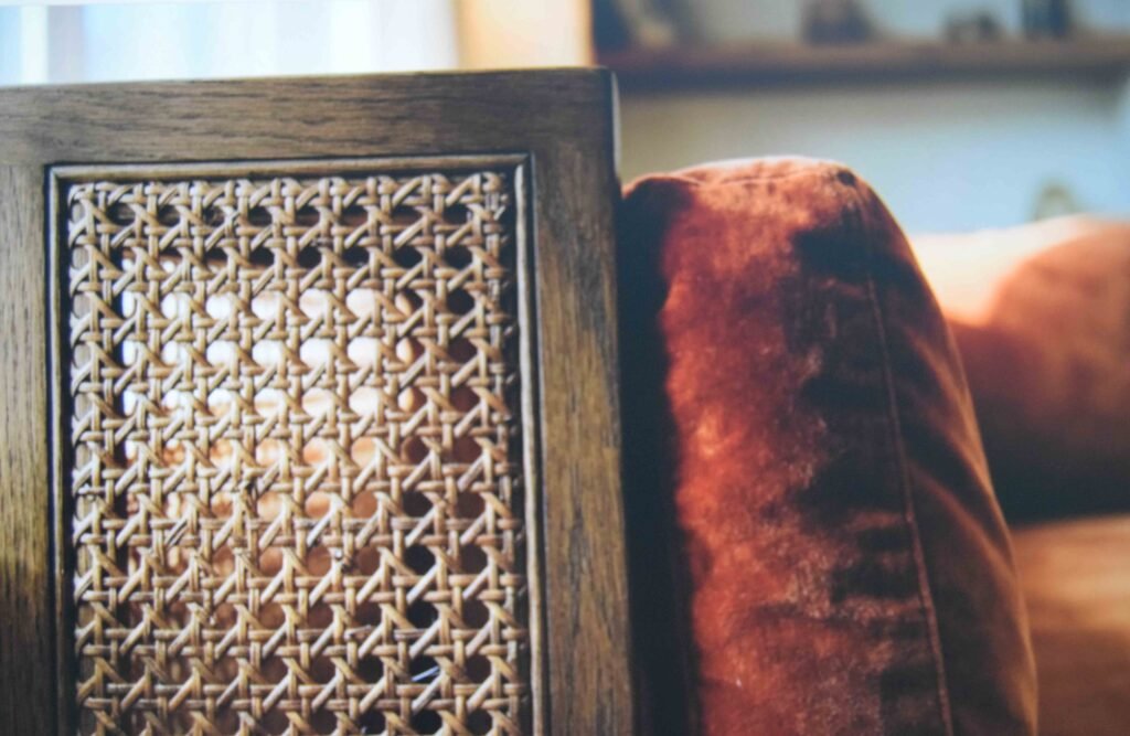
Cane belongs in this style, but it tips into beach house territory faster than any other material.
The rule I would follow is one woven item per sight line. A cane cabinet front or a rattan chair. Not both, plus a basket, plus a woven pendant, plus a jute rug underneath all of it.
Set it against something sleek so the texture reads as a decision. Lacquer, glass or velvet all work as the counterweight.
Inspect the weave carefully before buying used. Cane dries out and splits in heated apartments over winter, and re-caning is slow, fiddly work that usually costs more than the chair did.
11. Get the Scale Right on Space-Age Shapes
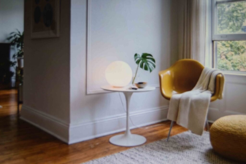
This is where funky living room ideas actually pay off. A globe lamp. A tulip side table. A bubble mirror. A glossy molded chair in mustard or tomato.
Scale is the whole game with these. A globe pendant sized for a restaurant will swallow a rental living room, so check the diameter against your table width before ordering anything online.
Then repeat one rounded shape across three objects at different sizes. Globe lamp, circular mirror, rounded vase. The eye reads the rhythm without ever consciously noticing it.
Molded plastic chairs turn up cheap secondhand. Flip them over and check the mounting points, because cracks there are common and not realistically repairable.
12. Keep One Glass or Chrome Piece for Air
Furniture from this era carries visual weight. Dark timber, deep upholstery, saturated color. Inside four hundred square feet that stacks up fast.
A single transparent piece releases the pressure. Glass side table, chrome and glass bar cart, acrylic stool.
Keep its surface nearly bare or the trick stops working. A glass table buried under mail and chargers is just clutter you can see through.
Plan to wipe it more often than you would expect. Fingerprints announce themselves on glass in a way they never do on walnut, and a smeared table undercuts an otherwise polished room.
Living with pets or toddlers? Put this piece in the bedroom and leave the main room without it.
13. Deal With the Modern Fixtures You Cannot Remove
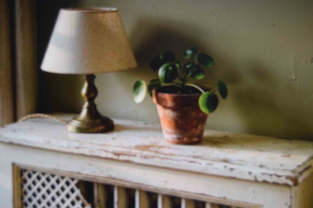
Every rental has something unattractive bolted to it. Usually a radiator, occasionally a fuse panel.
A vintage-style radiator cover turns that eyesore into a shelf, and it sits in place with no permanent fixing at all. You gain a surface for a lamp and a trailing plant in the process.
Cabinet handles are the other fast win. Unscrew the modern pulls, bag and label them for moving day, and fit brass or timber ones instead. Ten minutes of work changes how the entire kitchen reads.
Then hold your metals steady. Cool silver and honeyed brass in one sight line creates a quiet visual friction, so commit to one finish and let the other go.
14. Take It Into the Bedroom Without Overloading It
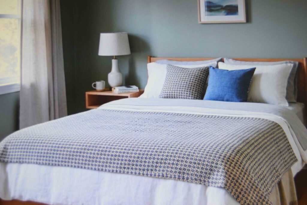
Apartment bedrooms rarely have the floor area for a full treatment. Restraint pays here.
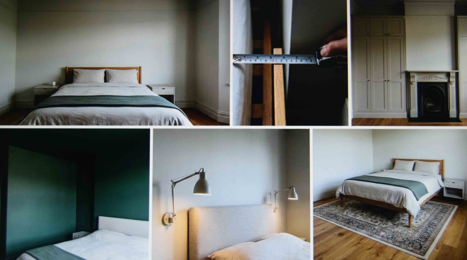
Keep the bedside symmetrical. Two matching lamps or two matching tables read as calm even in a cramped room. Where there is genuinely no space for a second nightstand, a shallow wall-mounted shelf at mattress height covers the same job.
On the bed, use one patterned blanket over plain sheets. Pattern layered on pattern makes a boxy room feel narrower than it already is.
This is also where a vintage apartment aesthetic quietly goes wrong. Pile on the textiles and the room stops reading as restful and starts reading as a fabric shop.
15. Decide Between Real Finds and Good Reproductions
Flea market pieces have something reproductions cannot fake. Wear patterns in the veneer, hardware worn smooth by fifty years of hands, joints that have settled.
Reproductions have improved enormously though, and for a rental they make sense. Lighter to carry up stairs. No mystery smell. No hidden structural cracks waiting for you.
Mixing both is completely fine. A slightly mismatched set reads as personality as long as the timber tones and colors agree.
DIY counts as sourcing too. A spray-painted lamp base or new pulls on a plain cabinet gets you most of the way.
Buy the sofa new and the accents old. That split works best in a rented space.
Practical Tips Before You Spend Anything
Photograph the room at noon and again at ten at night before buying. Colors that look mellow in daylight can turn muddy under a rental ceiling fixture.
Measure your doorway and the building elevator before committing to a credenza. Vintage case goods are wide and heavy, and a cabinet that will not turn the corner into your unit is an expensive lesson to learn on delivery day.
Box up every original handle, fixture and blind with a label on it. Deposits come back far more easily when everything can be restored exactly as found.
Aim for a room that feels playful and lived in, not a stage set. A colorful retro living room should look like someone eats dinner there. One or two era pieces plus your own things beats a space where every single object is period correct.
Frequently Asked Questions
What is the difference between retro and mid century modern?
Mid century modern names a specific design movement running roughly from the 1940s into the 1960s, defined by tapered legs, walnut and clean lines. Retro is looser and wider. It stretches across 70s color, 80s shapes and reproduction pieces that only nod at the period.
Which decade should I commit to?
Let your existing furniture decide. Slim legs and honeyed timber point you toward the 50s and 60s. Bold pattern and earthy color point toward a 70s inspired living room. Picking a decade that argues with what you already own means replacing far more than you budgeted for.
Can I combine this with plain big box furniture?
Yes, and most people do exactly that. Simple modern furniture makes a fine background. Lighting, textiles, art and one or two shaped pieces carry the style. A plain sofa in the right color disappears into the scheme entirely.
Will this make a dark or tiny studio feel worse?
It can, if you load up on dark timber and deep color at the same time. In a dim unit keep the walls and the large upholstery pale, then push the strong color into the rug, cushions and art where swapping it out later costs almost nothing.
Does any of this work in a rental kitchen or bathroom?
Some of it. Handles, a checkerboard vinyl floor mat, a framed print on an easel, a colored kettle or canister set. Avoid anything adhesive on tile or laminate, since those surfaces lift far more readily than painted drywall does.
Where to Start This Weekend
If one thing survives from all of this, make it the order. Light, then textiles, then the rug, then furniture. That sequence stops you buying something beautiful with nowhere to live.
Begin with a single corner. Get it right, sit with it for a week, and let it set the bar for the rest of the retro apartment aesthetic you build around it.
All of it walks out the door with you at the end of the lease. That was always the point.